This portfolio entry showcases a website I designed and developed for a client specialising in “After Builders Clean.”
In this blog post, I’ll guide you through some key sections of the site.
Once I’ve covered everything, I’ll share the URL so you can experience the creation firsthand in your browser.
Feel free to leave a comment, ask questions, or share any suggestions. Enjoy exploring!
Website Header
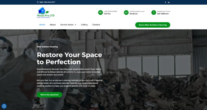
The website header is thoughtfully structured into three distinct sections to ensure that visitors have quick access to essential information. The first section highlights the business opening hours and social proof, establishing trust from the outset. The second section provides comprehensive contact details, making it easy for users to reach out. Finally, the header includes a clear navigation menu paired with a prominent call-to-action (CTA) button to book “After Builders Cleaning.”
Given the fast-paced nature of the construction industry, decision-makers responsible for booking cleaning services often have limited time to research. To accommodate this, I designed the header so that users can immediately make a booking upon visiting the site.
Index Page Hero Section
For the hero section, I incorporated a video showcasing a commercial after-build cleaning service. Even though the company is small, the video adds a professional touch and creates a strong first impression, helping potential clients see the business as highly competent and trustworthy.
The hero section also features an optimised H1 header, “After Builders Cleaning.” The client initially wanted “After Builders Clean,” but after conducting keyword research with SEMrush, we opted for the more frequently searched term to maximise visibility.
Below the H1 header, I added a compelling sub-header, “Restore Your Space to Perfection,” which immediately addresses why visitors are on the site. This is followed by a few engaging paragraphs: one that empathises with their problem (needing an after-build clean) and another that promotes the company’s services. The section concludes with a strong CTA button that reinforces the message: “We’re the solution!” This structure not only informs but also motivates visitors to take action.
Index Page Service Section
It was quite a challenge to find a suitable “royalty-free image” for this section. Most free image libraries feature models who aren’t adhering to health and safety standards, such as wearing helmets, high-visibility jackets, or safety boots, which would misrepresent a professional construction cleaning service.
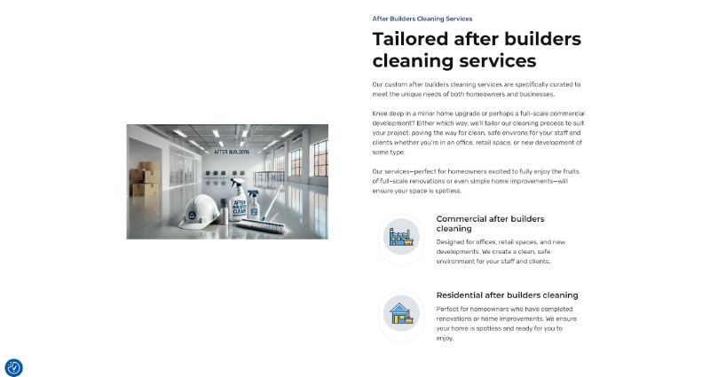
To overcome this, I decided to try something innovative by generating an image using ChatGPT AI. The image doesn’t include models, as the AI isn’t yet proficient at generating realistic human faces, but it produced a fantastic visual featuring essential elements: builders’ hard hats, cleaning products, and a broom. The space depicted is immaculately clean and shiny, perfectly reflecting the high standard of service that this company provides.

On the right side of the section, I added well-optimized SEO content to enhance the page’s search visibility. I also made sure to clearly highlight that the company offers both commercial and residential after-build cleaning services, making the information comprehensive and appealing to a wider audience.
Service Pages
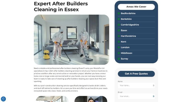
Each service page features well-written, SEO-optimised content, developed after conducting in-depth keyword research and analysis using SEMrush. The content is crafted to include relevant keywords strategically and even includes an FAQ section to address common queries and improve search visibility.
Since the business operates in multiple locations and aims to rank higher in Google search results, I recommended creating dedicated service pages for each location. This approach allows the company to target and rank for their services in each specific area, enhancing their local SEO efforts.

Each service page is equipped with a sidebar that includes an “Areas We Cover” list, linking directly to each location’s service page. This setup improves internal linking, which is a key SEO factor that enhances site structure and search engine crawlability.
Additionally, below the location list, there is a contact form with relevant fields, such as a dropdown menu for selecting the area, as well as booking dates and times.
At the bottom of each service page, I have added a strong call-to-action (CTA) section to encourage user engagement and bookings.
Portfolio Details
- Explore this portfolio piece in your web browser by following the links below.
