This is one of the earliest and most innovative websites I built for real-world use in 2017. I created it for a Lithuanian company specializing in Galvanization (“Metal Protection From Rust”), Metallization (“Decorative Metallic Coating”), and Restoration (“Metal Restoration”).
This website is translated into two languages, with a total of four pages for each language.
The pages of the website include Home, About Us, Showcase, and a Contact page titled “Say Hello.”
This post will explore the homepage hero, services, and CTA sections.
Towards the end, you will find a URL link to view the website in your browser.
Feel free to drop a comment, ask questions, or share suggestions. Enjoy the read!
Website Overview
This client didn’t have a clear vision for the website’s look and feel, so they gave me the freedom to express my imagination in showcasing their services. After extensive competitor research, I found only basic, boring websites that felt like digital brochures with no flair, focused more on wholesale rather than individual customers.
Since I had never encountered this type of business before, I was intrigued by their unique and cool services. My vision was to create something innovative, modern, and with a WOW factor.
With only some factual information about the business, the names of the services, and a few portfolio images for the gallery, I embarked on what has now become one of the most innovative and modern websites I’ve worked on.
At that time, I was relatively new to web development and didn’t have the coding skills to create such a website from scratch. Therefore, I decided to use an “HTML Website Template,” which I customized with my own CSS and HTML.
I also modified some JavaScript to slow down moving elements. The original template had a different section structure compared to the Chromavimas-Sidabravimas website. Essentially, I had a variety of sections to choose from in order to design and build this website.
After long hours of gathering cool images, writing content, and structuring each page, I ended up with this cool website.
Hero section

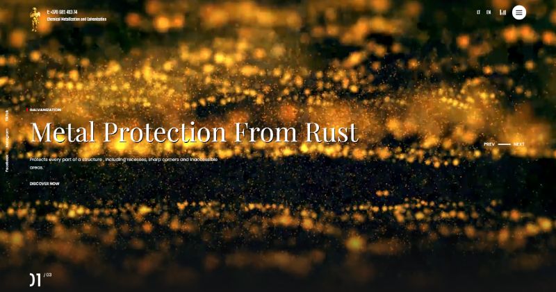
Creating a background video featuring floating gold dusts symbolizing the process of all the services, as each service requires spraying metallic paint on an object/item, was a visually engaging choice.
Additionally, incorporating a 3-slide carousel with each service name and a brief description served to aid website users in understanding the nature of each service. Since terms like “Galvanization” or “Metallization” might not be universally understood, these descriptions provided clarity.
Furthermore, each slide was accompanied by a prominent CTA button, encouraging visitors to discover more about the services offered..
Services Section

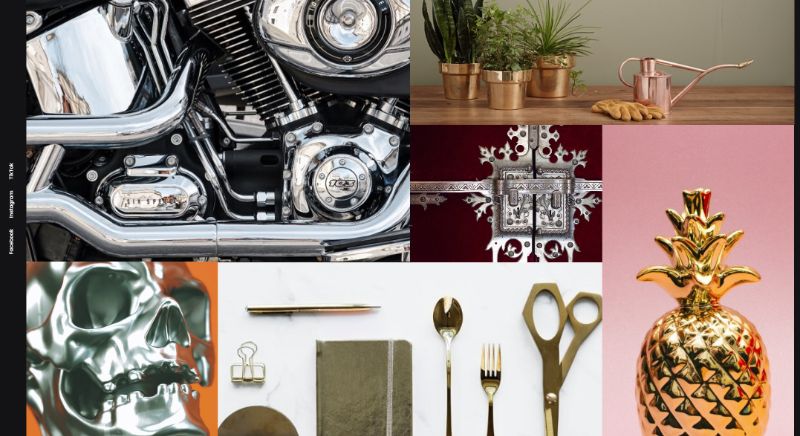
As mentioned earlier, these services are quite unusual, and it might be challenging for users to imagine utilizing them without some inspiration or ideas.
To address this, I uploaded six different types of images that, upon scrolling over, reveal the category names: Moto & Auto Parts, Household Items, Furniture, Gifts, Art, and Celebration. These categories help users envision the diverse applications of the services offered.
CTA Section

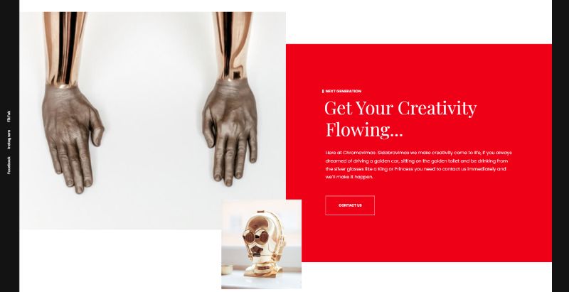
For these kinds of services, where imagination knows no bounds, I decided to include two images of the Star Wars character C-3PO and crafted a delightfully quirky CTA.
“At Chromavimas-Sidabravimas, we bring creativity to life. If you’ve ever dreamed of driving a golden car, sitting on a golden toilet, or drinking from silver glasses like royalty, contact us today and we’ll make it happen.”
I’m confident that incorporating a quirky CTA will boost the likelihood of people reaching out to the business without feeling hesitant about sharing unconventional ideas.
Portfolio Details
Explore this portfolio piece in your web browser by following the links below.
Website
