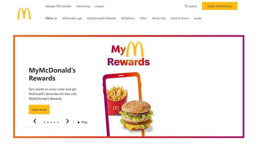
In this portfolio piece, I’ve chosen to recreate the McDonald’s website. It’s a single-page website with no functional links; its sole purpose is to showcase my ability to replicate the design.
This post will cover the website layout, top navigation menu, slider, and footer navigation menu. Towards the end, you will find the URL link to view the website in your browser and also link to check out my GitHub repository for the code.
Feel free to drop a comment, ask questions, or share suggestions. Enjoy the read!
Layout
To build this page, I chose to adopt a mobile-first approach, necessitating the implementation of media queries for three screen sizes to achieve the desired outcome. The breakpoints are set at 768px, 1024px, and 1280px.
The layout for the mobile view is quite straightforward, with most sections following this order: featured section image, section content, and CTA button.
The tablet and desktop view layout was more fun (dynamic). Some sections featured two columns in one row, with an image on one side and a header, content, and CTA button on the other. Other sections had three columns in one row, with each column set to display as a flex column, containing an image, content, and CTA button.
With the assistance of grid and flexbox, accomplishing this task was made simple.
Top Navigation Menu
After finalizing the navigation menus for both mobile and desktop versions, I recognized that the code had become overly complex and bulky due to the structure nature.
According to my Google re-search:
HTML is typically quicker to render due to its simpler nature, CSS rendering time can vary depending on factors like complexity and efficiency.
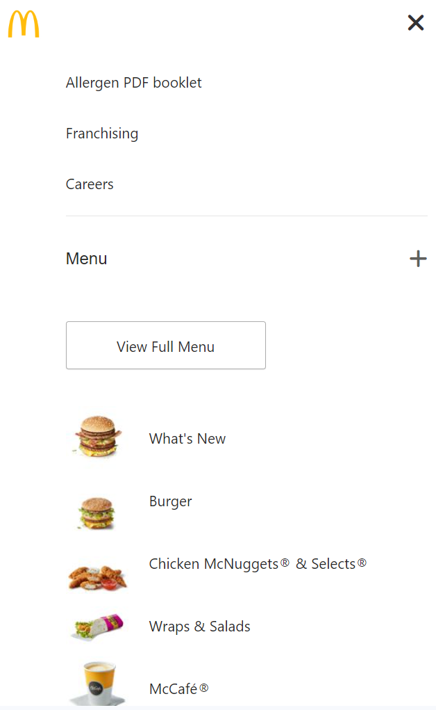
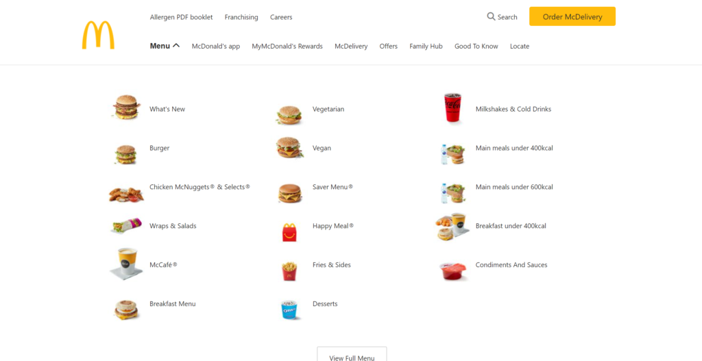
To address this, I decided to create two separate menus: one tailored for mobile devices and another for desktops.
This approach allowed me to achieve the desired result with less CSS more efficiently.
I utilized the CSS property “display” with the value “none” to hide the mobile menu and vice versa.
Carousel / Slider
In my code, I’ve labeled this section as a carousel. This carousel consists of five slides, each featuring a content box with a header, text, and a call-to-action button.
Additionally, the carousel includes navigation arrows, carousel indicators, and a button to toggle between automatic playback and pausing.
However, I found myself pondering the distinction between a carousel and a slider.
According to my Google re-search:
In essence, the terms slider and carousel are sometimes used interchangeably, but a slider typically involves manual user interaction to navigate between items, while a carousel may involve automatic or continuous movement of items.
Because my carousel can be controlled manually by user interaction and also features automatic playback with a pausing button, I’ve chosen to label this section in the blog post as “Carousel / Slider,” as you’ve already read.
This cunning maneuver ensures that you, my dear reader, remain as unoffended and unoutraged as a ninja who just found a secret stash of shurikens!
In the mobile view, the carousel displays sliders with the content box below the slides. However, in the tablet and desktop view, the display of the carousel changes, with the content box now positioned inside the slide.
I accomplished this by applying the CSS property “position” with the value “relative” to the carousel, and then using “position” with the value “absolute” along with additional code, which you can later review in my code.


Footer Navigation Menu
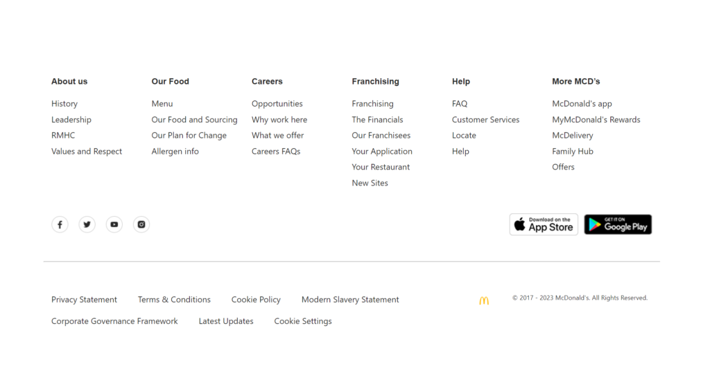
The website footer is divided into three rows. The first row houses the site navigation menu. In this design, the layout of the first row transitions from an accordion component to a six-column section.
To achieve this, I simply created six HTML elements with the class of ‘footer__nav–items’, each containing a header nested inside a button tag with the class “accordion” and an unordered list element with list item elements.
With the help of JavaScript, I implemented the code that establishes an accordion functionality.
This code selects all elements with the class name “accordion” and attaches a click event listener to each one. When an accordion is clicked, it toggles an “active” class on the clicked element and adjusts the visibility of the associated unordered list element .
Furthermore, it ensures that only one accordion can be open at a time by closing any other open accordions when a new one is clicked.
To achieve the six-column layout for the desktop version, I configured the first row to be displayed as a grid and set the property “grid-template-columns” with the value of “repeat(6, 1fr)”. Then, I ensured to remove the toggle icons and adjusted the HTML element “unordered list” to have a height of 100% by default.

Portfolio Details
- Explore this portfolio piece in your web browser by following the links below.
- Website
- GitHub Repository
- HTML
- SASS dir
- Index
- Components dir
- JS dir
- McDonal Official website
