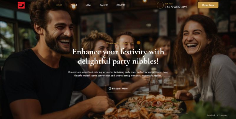
Party Buffet reached out to me because they needed a suitable website and wanted to increase their customer base and sales.
In this blog post, I will answer why I choose to use “HTML template”. I will also walk you trought few website pages and sections and will go more in details about the order page.
And guess what? At the end of it all, I’ll hook you up with the URL link so you can check the website right in your browser.
Feel free to drop a comment, ask questions, or share suggestions. Enjoy the read!
Why I choose to use Website HTML template?
The main factor was client budget. So in order to save time designing the website I choose to go for HTML template.
Also from the convesation with client I understood that website will be very static meaning that no updates will be done very soon.
So I tought by having Html website will also save a client money by not having to pay for maintance such as plugin, wordrpess or theme updates and also not to worrie about compatiblilty.
Website overview
I felt it necessary to let the company’s services and mouthwatering menu options speak for themselves, so we stuck with a relatively simple layout on each page.
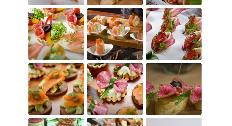
This meant the critical content customers would be interested in wasn’t complicated by unnecessary fluff.
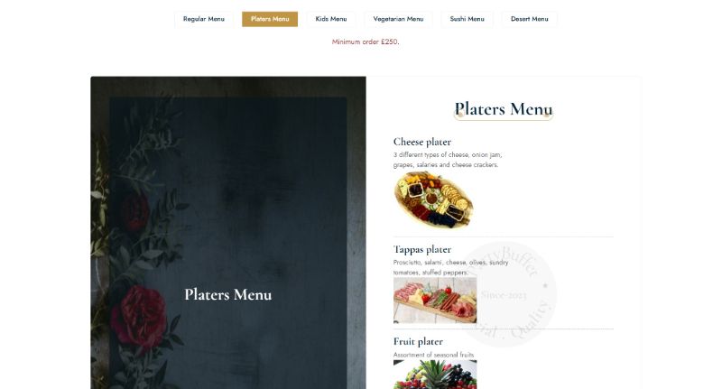
In keeping with Party Buffet’s branding, I used high-quality images that showcased the kind of experience potential customers could have if they chose the company to take care of catering their event.
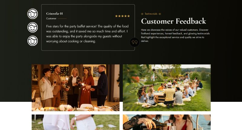
To help with the company’s social proof, I included a smart and moving customer feedback section at the bottom of the website.
This means that rather than just taking the company’s word that they will get excellent service, prospective customers can learn about their experience from previous customers.
Order page
The client wanted potential customers to place orders directly on their website to avoid third-party platform fees and offer better price deals.
With 8 menu options and 3 desert options available, the challenge was to make the user experience (UX) friendly, allowing users to know their total cost without using a calculator or waiting for an invoice email.
I decided to develop a live order form calculator. This feature updates the total price on the page as the user adds items to their order.
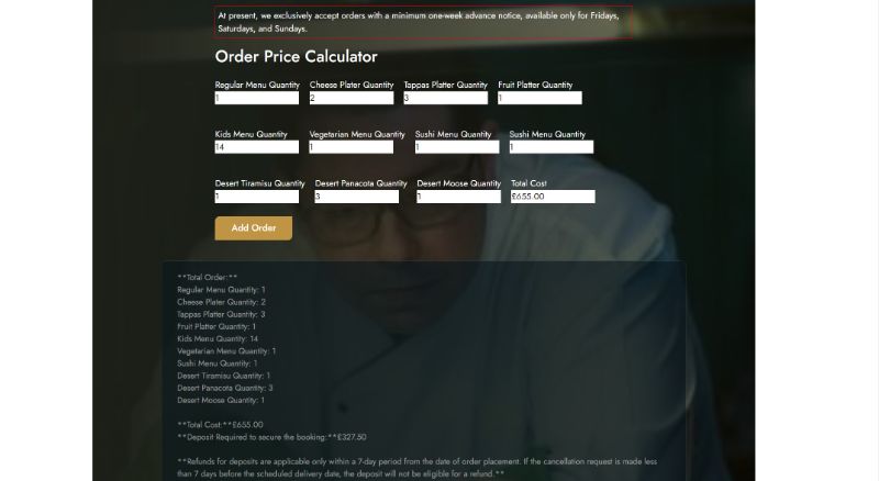
The form includes:
- 11 input fields for users to specify quantities for each menu item.
- An additional field that updates the total order price in real-time.
- A large text area that automatically generates a detailed invoice with all relevant order information.
Once users complete their order, they can review the full invoice. Below the invoice, they can input order details such as name, address, and delivery date.
Upon submitting the order, users receive an automatic copy of the order via email, and the client receives the order in their inbox to decide whether to accept it.
Portfolio Details
- Explore this portfolio piece in your web browser by following the links below.
