This portfolio piece symbolizes my journey as a web developer.
SUKHI222, also known as Project222, is a human rights campaign I became involved with in 2017.
Throughout my time as a volunteer web developer, I have rebuilt this website three times: twice in WordPress and once from scratch.
I connected with SUKHI222’s founder, Charles, through the organization that helps with USA Visa.
Charles had a vision he had been working on for years but lacked an online presence to showcase his achievements and attract potential donors to support his great work.
When I started working with Charles, I had limited web development experience, mostly from college using Dreamweaver and building a few websites on Wix. However, Charles believed in me and trusted me to design and develop the website, including the sitemap.
After a long conversation with Charles, which helped me understand his vision, I researched my options and decided to use the WordPress platform with the Elementor page builder.
After a year or two, I decided to build the website from scratch, writing the code myself, as I found WordPress limited in achieving certain features I wanted to integrate (though I can’t recall the specific features now).
In this blog post, I’ll walk you through my experience in developing this website from scratch and discuss site navigation and CTA button design and at the end, I’ll share a link to an blog post discussing the WordPress version.
And guess what? At the end of it all, I’ll hook you up with the URL link so you can check the website right in your browser.
Feel free to drop a comment, ask questions, or share suggestions. Enjoy the read!
Overview
After completing an online Udemy course on CSS Flexbox, Grid, and Sass, as well as the “SEO Blueprint” course, and gaining some volunteering experience at Creative-webuk (now known as dbeta), where I acquired experience and knowledge in working with PHP, I felt more ready than ever to develop this website from scratch.
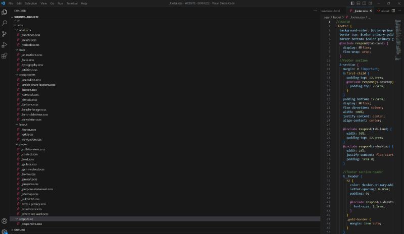
This was my first major project where I had the opportunity to establish a proper folder structure for all files and SASS

Set up SASS mixins and variables, utilize PHP “include” statements to reuse common sections and code across multiple pages, set up Google reCAPTCHA, configure PHPMailer, implement Google Analytics, and host all images on a subdomain, accessing them through a PHP-defined constant.
Navigation Menu
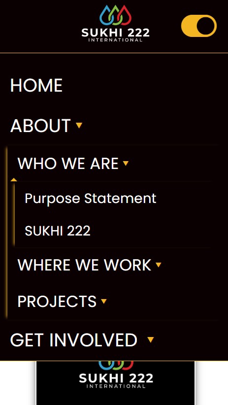
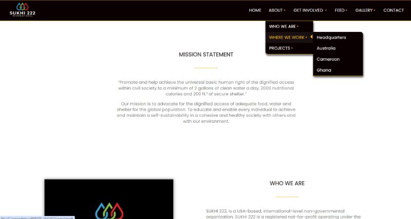
I remember it took me a long time to get this right. I kept encountering an issue when trying to add nested submenus to a submenu. I spent hours searching for a solution before I finally found one: using <input type=”checkbox”>.
My navigation consisted of three sections: the logo, the mobile menu toggle, and the navigation buttons.
With the help of the flexbox to arrange these three sections according to my preferences.
Additionally, I applied specific CSS styles to all checkbox inputs to customize their behavior.
This involved using several complex CSS selectors, such as #menu li:hover > input[type=”checkbox”] + .sub-menu.
This selector targets .sub-menu elements that immediately follow an element of type “checkbox” within an element under an element with the ID “menu,” specifically when the is being hovered over.
Through the application of CSS, I managed to create a visually appealing navigation menu. Feel free to evaluate it yourself!


CTA Button Design
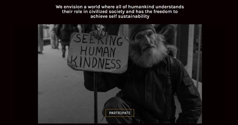
I developed this button by structuring it with HTML, creating a container “div” and an anchor “a” tag for the button itself. Inside the anchor, I added four “span” elements for decoration.
Then, I applied CSS styles to customize the button’s appearance. Using classes, I targeted specific elements to adjust things like size, color, padding, and positioning. I used Flexbox and absolute positioning to align the button elements as desired.
For the animation, I created keyframe animations in CSS to define the movement of each span element. These animations involved transformations like translation or rotation to achieve the desired effect. I also used delay properties to stagger the animations for added dynamism.

Project Summary
This whole project was a fantastic learning experience and a breakthrough for me because it gave me the confidence that I’m now capable of developing websites.
Looking at the code now, I would have done quite a few things differently. But, hey, I bet most developers could say the same after looking at their code few years after its been writen. We all live, learn, and progress.
Portfolio Details
- Explore this portfolio piece in your web browser by following the links below.
