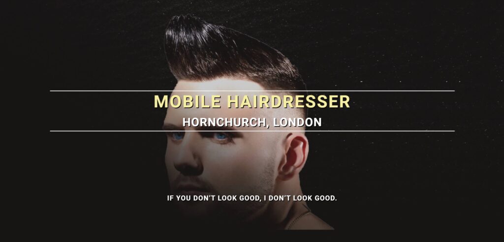
This is among the earliest websites I ever designed and developed for real-world use. I created this website for my brother, who was working as a mobile hairdresser at the time (2018).
This website comprises a total of seven sections, carefully chosen to present all the essential information needed to secure job opportunities as a mobile hairdresser.
The sections of the website include the Hero, About, Experience, Testimonials, Portfolio, Services, and Contact.
This post will explore the Navigation menu, as well as the About and Services sections of the website.
Towards the end, you will find the URL link to view the website in your browser and also link to check out my GitHub repository for the code.
Feel free to drop a comment, ask questions, or share suggestions. Enjoy the read!
Navigation Menu

Despite being a one-page website, I opted for a sticky menu that underlines each menu item when the visitor scrolls to the corresponding section.
To implement a sticky navigation menu I used JavaScript.
When the user scrolls the page, the myFunction function is executed. The script calculates the offset position of the navbar and adds a “sticky” class to it when the scroll position reaches that point. This class ensures that the navbar remains fixed at the top of the page as the user scrolls down.
To implement an active menu, I utilized jQuery.
The script dynamically updates the active navigation section based on the user’s scrolling behavior. It listens for scroll events on the document, triggering the onScroll function to update the navigation accordingly. Additionally, when a navigation link is clicked, the script adjusts the classes to highlight the clicked link and smoothly scrolls to the corresponding section on the page.
About Section

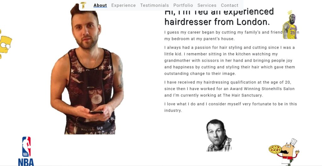
Considering the website’s essence and his profession, I recognized that the crucial aspect of securing clients was to present him as a professional to the site visitor. This was the pivotal point where he could distinguish himself from the competition and where the site visitor would make their decision.
I opted to achieve this in a quirky yet professional manner. Knowing my brother intimately, I chose to craft a narrative detailing his childhood decision to pursue hairdressing. Alongside this, I included a photograph of him (although it could have been better, I couldn’t persuade him to take another one, haha).
Additionally, I incorporated five images representing various facets of his life, each providing insight into his personality and interests: The Simpsons, Al Bundy, NBA, LeBron James, and Pizza (If you know, you know, haha).
Images are revealed as the site visitor scrolls to the About section. To accomplish this animation effect, I utilized the “aos-animation library”
By simply adding attributes to the HTML elements, such as data-aos=”fade-right” or data-aos=”fade-up”, I controlled the animation.
Services Section

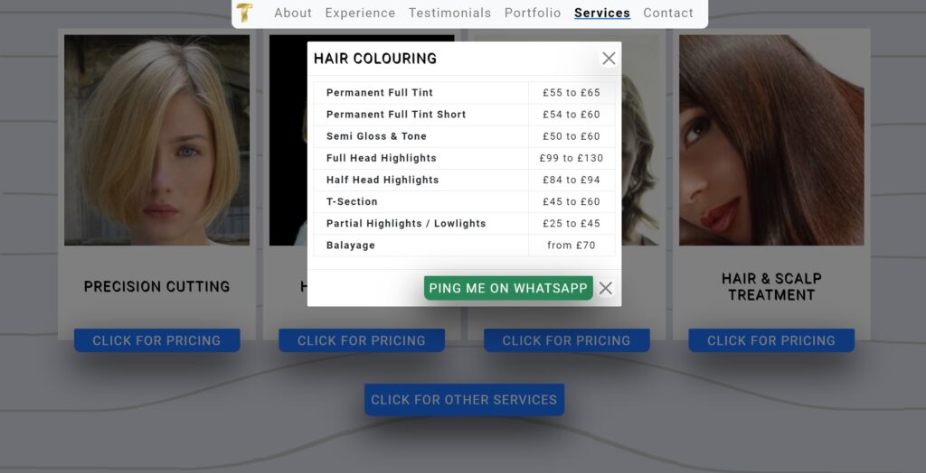
Upon receiving the list of services he offers, I realized that presenting them as a single list would overwhelm the user and negatively impact the user experience.
Therefore, I opted to divide all the services into four categories, each accompanied by a high-quality image representing the category.
Additionally, I included a button beneath each category that, when clicked, triggers a pop-up displaying the list of prices and a call-to-action button to book an appointment.
The call-to-action button was configured with a WhatsApp generated attribute, enabling users to seamlessly open the WhatsApp app on their phone upon clicking.
To implement the pop-up functionality, I utilized Bootstrap “Modal” component.
