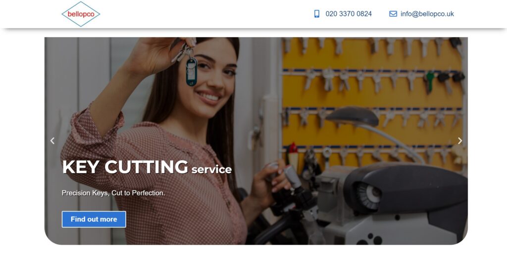
This portfolio piece showcases a website I developed for a client. They approached me with a request for a website for their small business, which offers key cutting, cleaning services, and man & van services.
I know, right? It’s like a wild mix of services! I tried to explain to the client that having separate websites for each service would be better for SEO.
According to my Google re-search:
Having a website focused on a single service typically outperforms a website offering multiple unrelated services.
But the client were adamant, so here we are—embracing the chaos with a single super website!
Now, let’s dive into the juicy details! I’ll be walking you through the key pages of the website: the index page, along with the spotlight on specific service pages like key cutting and cleaning.
And guess what? At the end of it all, I’ll hook you up with the URL link so you can feast your eyes on the masterpiece right in your browser.
Feel free to drop a comment, ask questions, or share suggestions. Enjoy the read!
Client Request
The client desired a minimalist website tailored to their target audience, emphasizing simplicity and easy navigation. They specifically requested no top navigation menu.
Despite lacking specific examples, the client entrusted me with translating their vision into a visually appealing design that effectively drives results.
Index Page
Initially, the client aimed to feature only images of the services on the homepage. However, I persuaded the client that incorporating additional sections would enhance professionalism and increase the likelihood of converting website visitors into customers.
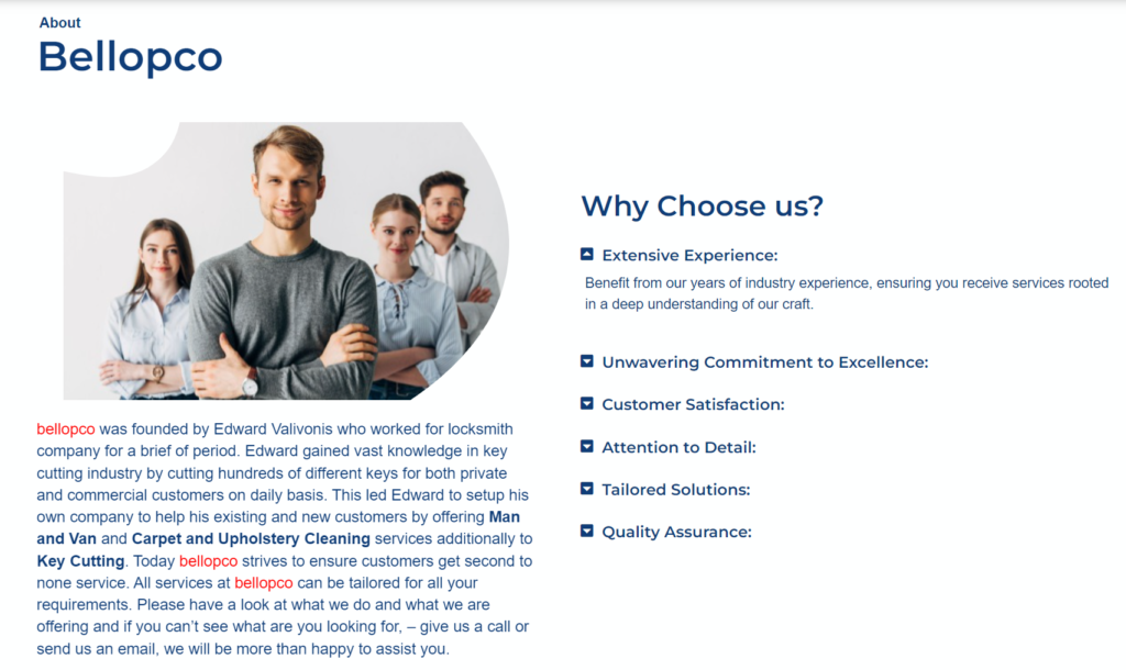
I introduced two-column sections: “About Bellopco,” providing an ideal platform to introduce the business to potential customers and showcase the advantages of its services or products, and “Why Choose Us,” highlighting the unique qualities that distinguish the business and set it apart from competitors.
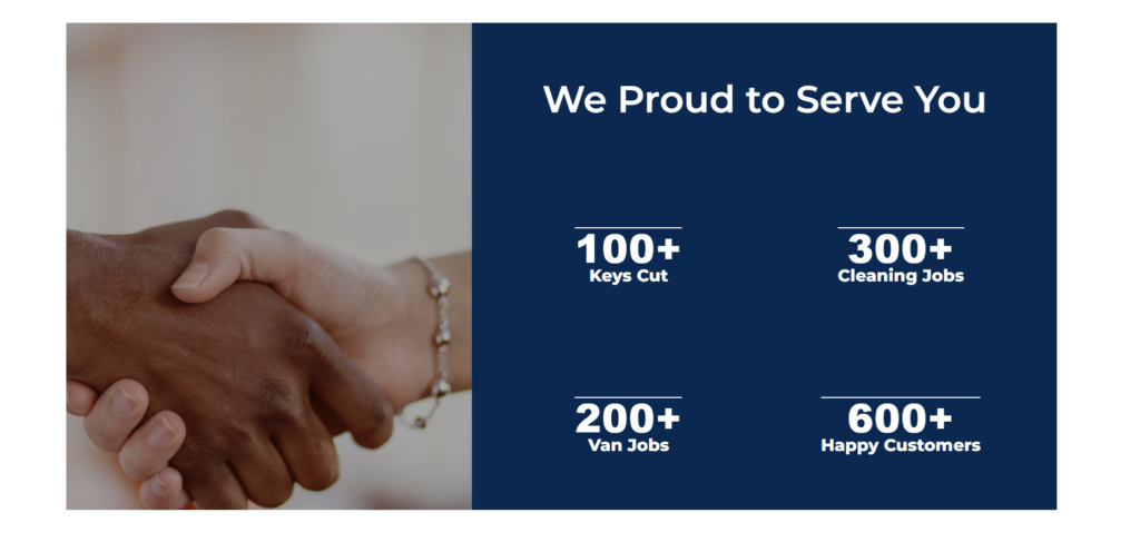
I’ve introduced a section titled “We’re Proud to Serve You,” where I’ve showcased statistics on completed jobs, providing visitors with insight into the company’s experience and impressive track record.
Furthermore, I’ve added an image of a handshake to evoke emotion and inspire trust.
According to my Google re-search:
Including a handshake image on your website can offer several benefits, particularly in sections related to partnerships, agreements, or collaboration.
Furthermore, a “testimonial” section has been incorporated to foster trust with site visitors. Additionally, there’s a call-to-action section aimed at motivating visitors to take action.
Key Cutting Service Page
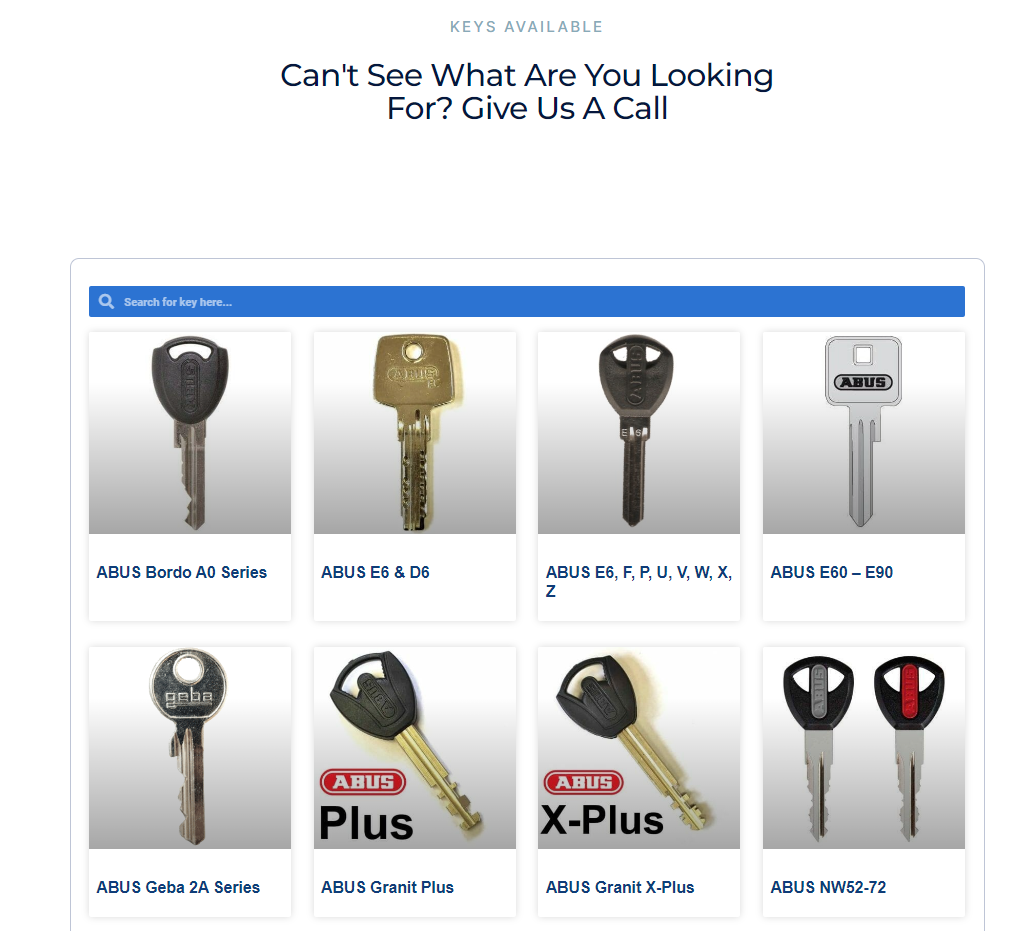
For the Key Cutting Service Page, I needed to showcase an extensive selection of 48 keys while providing customers with the convenience of a search bar to quickly find their desired key rather than manually scrolling through each option.
Initially, I considered using the “JetSmartFilters” plugin for this purpose, but considering the client’s budget constraints, I devised a cost-effective solution.
I created a comprehensive key database by uploading each key as a post under the category “keys.” Subsequently, I displayed all the keys on the service page using the “Posts widget” with a query term for the “keys” category, sorted by date.
To further enhance user experience, I incorporated a “search form widget,” enabling visitors to easily search for their specific key. This approach not only fulfilled the client’s requirements but also provided the opportunity to increase the website’s visibility on Google search engine results pages by expanding the number of indexed pages.
Cleaning Services Page
The Cleaning Services Page showcases a range of 16 services, each accompanied by a brief description. Acknowledging the potential challenge of mobile view scrolling due to the abundance of services, I opted to employ an accordion widget for each service.
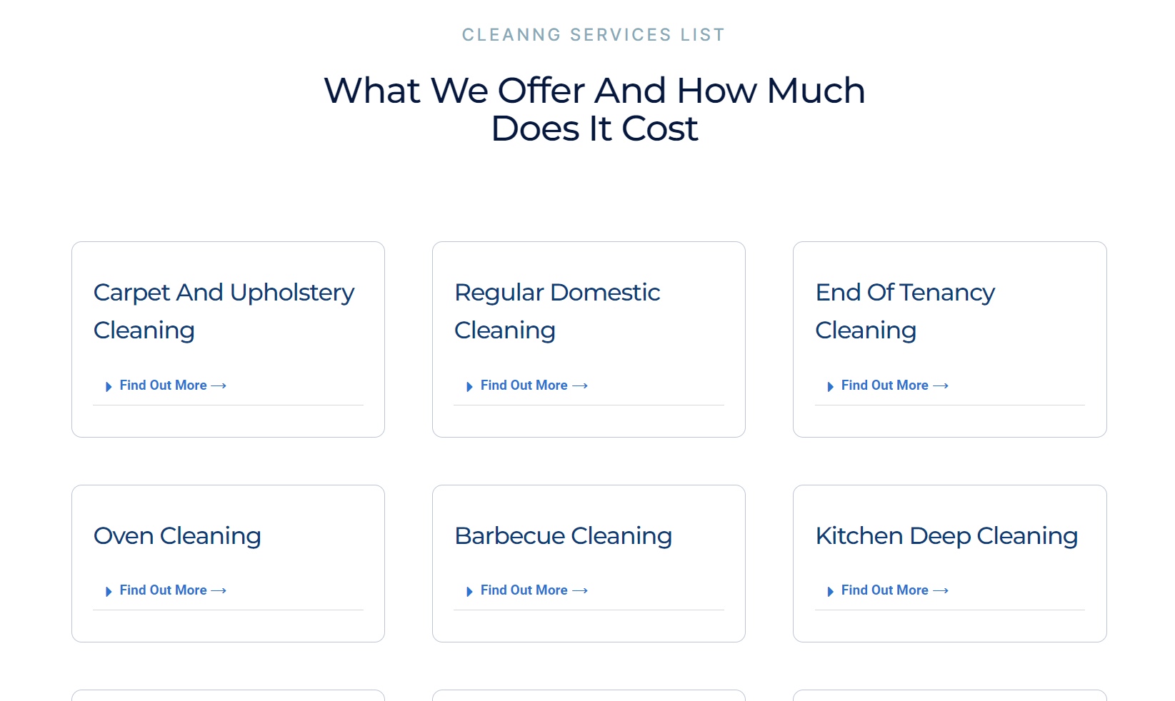
Additionally, I strategically placed a “book now” call-to-action button at the end of each service description paragraph to prompt visitors to take immediate action. This approach not only optimizes user experience by streamlining navigation but also encourages visitor engagement and conversion on the website.
Website Overview
I’ve designed a simple, responsive design with blue as the primary color. Blue is chosen because, in website design, it’s commonly associated with trust, reliability and professionalism. Many prominent brands like Facebook, PayPal, American Express, and others utilize blue in their branding, reinforcing its effectiveness in conveying these qualities.
During the construction of this website, I ensured the utilization of high-quality, optimized images, each equipped with an alt tag to aid visually impaired readers and enhance search engine crawlability and ranking. Additionally, I integrated informative content throughout the site.
Semantic HTML elements were employed extensively to assist search engines in understanding the importance and context of each web page, thus improving accessibility. Furthermore, all headers were meticulously structured in a hierarchical order to enhance readability, user experience, and SEO performance.
In terms of navigation, all service pages were equipped with breadcrumbs, facilitating clear navigation paths for users and enhancing SEO through internal linking. Throughout the pages, strategically positioned CTA buttons were implemented to encourage user engagement and direct them towards desired actions.
Moreover, each service page featured an FAQ section to address common queries and provide valuable information to users. This proactive approach was especially beneficial for the client’s small company, as it aimed to reduce the volume of inquiries and alleviate the burden on the limited staff.
Portfolio Details
- Explore this portfolio piece in your web browser by following the links below.
