This portfolio piece showcases a website I designed and developed while working at Certo, where I was hired as a web manager in 2021.
Let’s dive into the details! I’ll walk you through the website, including the structure of the index and product page .
And guess what? At the end, I’ll share the URL link so you can check out the website in your browser.
Feel free to drop a comment, ask questions, or share suggestions. Enjoy the read!
Index Page
Let me start by saying that I now regret using the “fade in left” and “fade in right” animations for most elements on this website. At the time, I thought it looked good, but looking at it now, I wish I had used a “fade up (slow)” effect instead. Anyway, let’s move on—we’ve all made some design choices we cringe at later!
The homepage is structured into seven sections:
- Hero section
- About section
- Recent Pojects section
- Services section
- International Projects section
- Client logo section
- CTA section
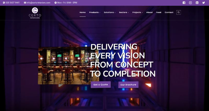
The hero section captivates with a background video of a tunnel featuring windows and lights, evoking the sensation of navigating through a construction site akin to a roller coaster journey through an unfinished building.
Positioned prominently at the center of the screen is a striking image from a previous “Fit Out” project, accompanied by the compelling text “Delivering vision from concept to completion.”
Next to this, users are prompted to engage further with a CTA button and an option to download the company brochure, requiring an email address for access.
Following this impactful introduction, the about section provides promotional content and insights into the company, fostering familiarity and trust.
Transitioning seamlessly, the page showcases recent Certo-Interiors projects, offering glimpses into six completed endeavors through captivating photos, succinct descriptions, and convenient access to additional project details.
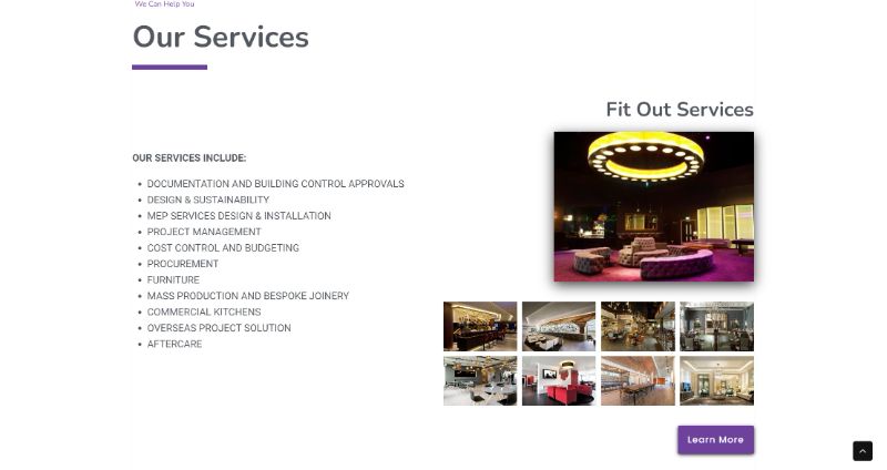
The services section introduces a visually dynamic element with a scroll effect, maintaining a stationary left side while the right side scrolls upward, presenting services and accompanying images in an engaging manner.

The international projects section employs a world map adorned with red pins to denote Certo’s global reach, bolstered by introductory text.
This strategic display aims to instill confidence in potential overseas partners by highlighting Certo’s extensive experience in managing international projects.
Elevating credibility further, the clients’ logos section features a curated gallery of recognised brands Certo Interiors has collaborated with, reinforcing trust and reliability for prospective clients.
Lastly, the CTA section serves as a proactive invitation for website visitors to take the next step, fostering interaction and facilitating seamless communication with Certo Interiors.
Product Page
Certo has two main service pages: “Fit Out” and “Refurbishment.” Each page starts with a stunning, eye-catching portfolio photo that represents the service, followed by promotional text and a table of contents for the page. This setup immediately engages visitors and provides a clear overview of what to expect on the page.
Next, there’s a section detailing Certo’s process, giving potential clients a clear understanding of what to expect. This transparency builds trust and sets clear expectations.
Following this, we showcase all the Fit Out solutions, from cost consulting to turnkey solutions, providing a comprehensive view of the services offered.
The page also includes an FAQ section to address common questions and concerns, enhancing user experience by preemptively providing important information.
Finally, a CTA section encourages visitors to take the next step, whether it’s reaching out for more information or getting started on a project. This structured approach not only provides valuable information but also guides the visitor smoothly through the decision-making process.

Portfolio Details
- Explore this portfolio piece in your web browser by following the links below.
