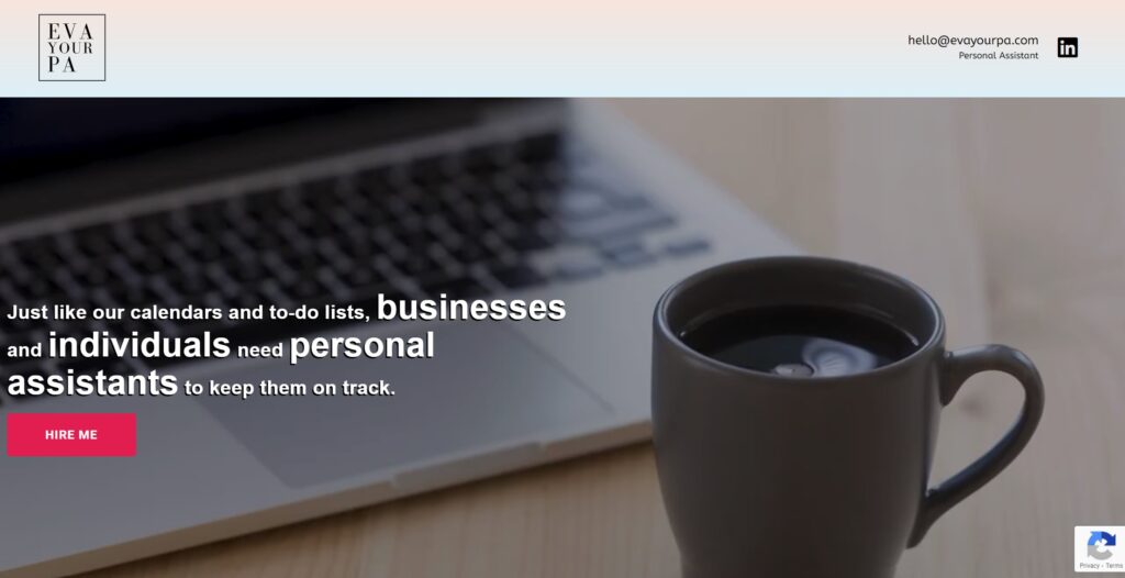
This portfolio entry showcases a website I crafted for a client who works as a Personal Assistant/Executive Assistant (PA/EA). She came to me with a precise idea of the functionality she required.
Now, let’s delve into the intriguing details!
Once we’re finished, I’ll furnish you with the URL link so you can explore the creation firsthand in your browser.
Feel free to drop a comment, ask questions, or offer any suggestions you may have. Enjoy the experience!
Client Request
The client wanted a minimalist website, akin to a digital brochure, designed specifically for busy founders and CEOs. The goal was to provide easy access to services, pricing information, and contact details.
Design Process
After browsing for inspiration and reviewing similar websites offering the same service, I noticed a common theme of white backgrounds and a primary color. However, I opted for a more distinctive and visually appealing design, aiming for something unique and aesthetically pleasing.
I opted for a captivating color scheme, blending Misty Rose and Columbia Blue gradients as the background, accentuated by vibrant Ruby Red CTA buttons. To add a unique touch, I selected “Bad Script” font-family for headers and “ABeeZee” for text, creating a visually appealing design reminiscent of a delightful cupcake.
Website Overview

I’ve structured this website into 9 distinct sections to ensure a seamless user experience:
Header Section: Featuring the website logo, email, and a LinkedIn favicon linked to the client’s LinkedIn page for exploring her experience.
- Hero Section: Showcasing a background video of a coffee mug, symbolizing energy, accompanied by a quirky quote and a prominent CTA button.
- Client Showcase: Highlighting the clients the founder has worked with to instill trust in the visitor.
- Service Section: Divided into 3 categories of services that visitors can easily relate to.
- About Section: Providing a brief introduction about the company founder, complemented by a background image of a smiling PA to enhance website UX.
- Package Section: Outlining the 3 packages available, offering clarity to visitors about what to expect when engaging with the services.
- FAQ Section: Addressing common questions to reduce unnecessary emails and streamline communication.
- Contact Form: Allowing visitors to easily reach out for inquiries or assistance.
- Footer
As an added bonus, I’ve incorporated the Nitro Pack plugin to elevate the user experience, ensuring smooth browsing for visitors. Also to shield my client from an spam emails, I’ve integrated Google reCAPTCHA.
Portfolio Details
- Explore this portfolio piece in your web browser by following the links below.
