This portfolio piece showcases a website I developed for a client who is based in Denmark. They approached me with a request for a website for their quite new bussines in where they specialisd in building summer houses and also offered few other services.
Now, let’s dive into the juicy details! I’ll be walking you through the website: the index page structure, along with product and contact page.
And guess what? At the end of it all, I’ll hook you up with the URL link so you can check the website right in your browser.
Feel free to drop a comment, ask questions, or share suggestions. Enjoy the read!
Client Request
The client sent me several website URLs as examples of what they liked and wanted something similar. I assured the client that the website I would create would look and feel even better than the examples. This assurance led the client to trust me with translating their vision into a visually appealing design that effectively drives results.
Index Page
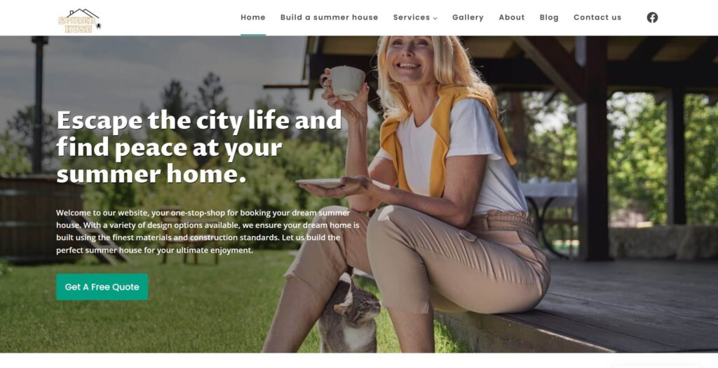
The index page was divided into seven sections, excluding the header and footer. The hero section features an image of a smiling woman with her cat, enjoying coffee on the porch of her summer house. This is accompanied by an H1 header that reads, “Escape the city life and find peace at your summer home,” along with a brief introduction to the company’s offerings and a CTA button encouraging users to get a free quote.
The following sections are: About Us, Featured Projects, Available Summer House Designs, Testimonials, and Additional Services.
The structure of these sections was carefully planned to ensure that website visitors can relate to the content, learn about the company, see their projects, and feel assured of the company’s credibility through customer reviews.
After viewing six available designs and falling in love with one, they can read testimonials from happy customers and explore additional services like the “water collection system” to enhance the sustainability of their summer house.
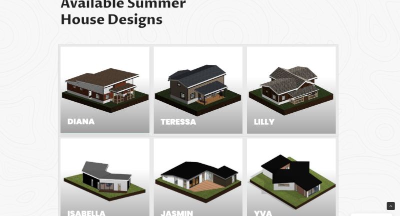
Product page
Each product page features high-quality images and provides all the essential information customers need before deciding to contact the company.
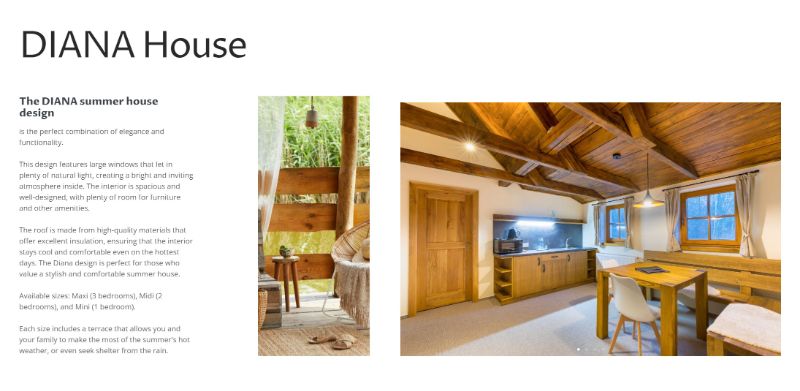
This includes a step-by-step outline of how the process works. Each product is available in three sizes—mini, midi, and maxi—with all size information, pictures, and drawings conveniently located on the product page.
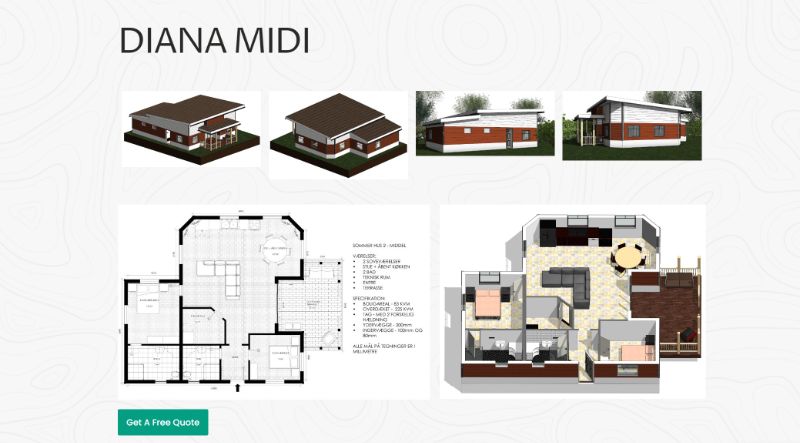
This ensures potential customers have all the details they need before reaching out to SpiderHuse. This approach is mutually beneficial: clients save time by finding all necessary information upfront, and business owners don’t need to hire additional staff to handle inquiries over the phone or via email.
Contact Page
This page includes a contact form with all the required fields, along with additional dropdown questions that potential customers need to answer before contacting SpiderHuse.
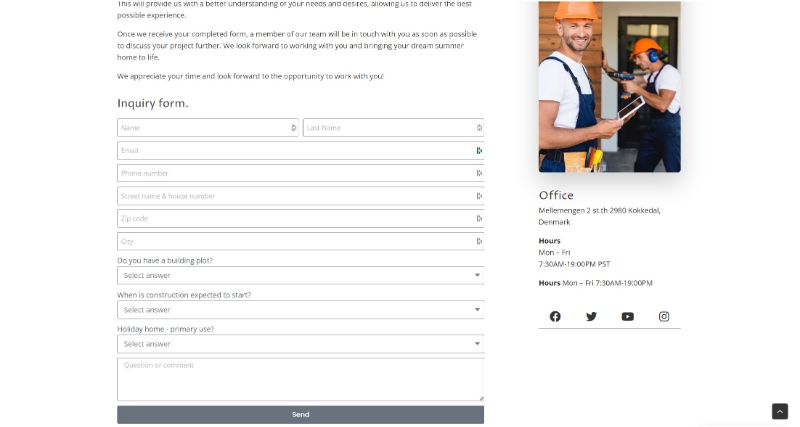
This allows the company to efficiently handle inquiries and allocate the appropriate resources based on the responses.
There is also a paragraph explaining what happens after the inquiry submission, as well as all the contact information including address, social media links, opening hours, and a Google map displaying our location.
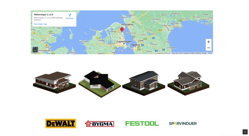
Additionally, the page features a slideshow of all available summer house designs and logos of well-known brands SpiderHuse collaborate with to build trust, showcasing their partnerships with reputable companies known for their high-quality materials and products in Denmark.
Portfolio Details
- Explore this portfolio piece in your web browser by following the links below.
